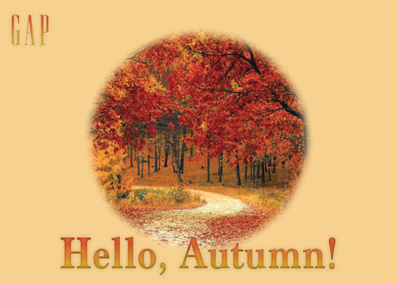
Postcard Assignment
|
|
|
|
This was my first photoshop assignment. The first thing we learned was how to create a 6 x 4 page on photoshop to make as a postcard. Then after it was created I dragged a random Autumn photo from the St Joseph's website to the page. I was able to crop the Autumn photo into a circle by using the elliptical marquee tool. I made sure to hold shift while I was making the circle too so it would be perfectly symmetrical. I feathered out the circle, then hit select, then inverse so the outside of the circle would delete and the inside would stay. To make this more Autumn themed, I changed the background color by picking a color I liked in the Autumn photo and hitting option delete. Then to add text, I selected the text tool and wrote 'Hello, Autumn!' I changed the text font and size, then added gradient to it as well. Since it was Fall, I thought that clothing brands would probably try to advertise their Fall clothing, which is why I used the Gap logo. All I did was find a transparent logo and drag it to my postcard. I sized it down and used the same layer style effects as what I have for my text. Although this postcard turned out pretty simple, the process it took to make this helped me improve my photoshop skills.
Advertisement: Inspiration and Influence
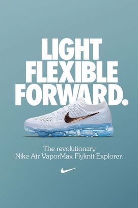
I chose this imagery because I liked the simplicity of the color scheme, and how the ad design was well put together and bold enough to catch my attention. I think the designer created the final design by envisioning a powerful message, and making it attention grabbing by scaling the fonts in order for the words to stand out. They also made the Nike logo on the shoe gold so it's easily recognizable to the audience. |
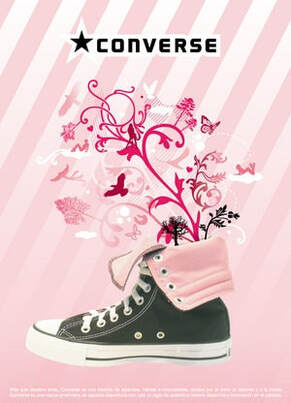
This poster caught by attention because of it's pretty design, and I thought the pink color and illustrations stood out from the majority of the other shoe poster. The designer created the final design by conveying their message through illustration effects and color, like the swirls and flowers coming out of the shoe, as well as the pink and white striped background.
|
|
|
|
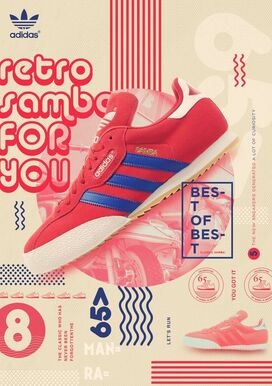
I really liked the bright pinkish red color of the shoe and words. This ad seems very unique and retro, with many patterns incorporated into the design. It's a very interesting and aesthetically pleasing piece to look at, and I love how everything goes together well. The designer definitely took patterning and placement into consideration, and made sure that this ad was just right and not too overwhelming. |
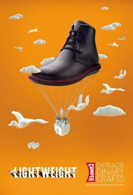
I found this imagery to be very eye catching, with the bright orange color and the big picture of the boot that's supposed to act like the balloons from the movie UP. The entire ad creatively portrays how the boot is made to be lightweight, which is what I think the designer was going for when creating the final product. |
Practice Shoe Advertisement
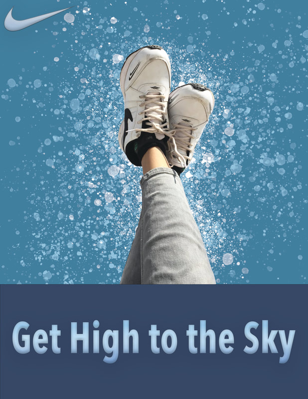
This is my shoe print advertisement. First, what I did was create a new paper. Next I created a new layer and made a rectangle at the bottom with the rectangle tool. After choosing my shoe photo, I opened it on photoshop and used the lasso tool to cut around the shoe. Then I masked the shoe layer and got rid of the edges with the brush tool. When I was done with the masking, I moved the shoe to the center of the page. I wanted this poster to have a sky theme, so I changed the colors of the layers to blue. To make the background look more interesting and eye catching, I made a new layer, then opened the brush settings, clicked the splattering brush, and added it around the shoe picture. I made sure to put the new brush layer above the shoe layer so the splatters wouldn't cover the shoe. I also gave the splatters more variety by having different colored splatters, as well as having small splatters near the shoe that get progressively bigger as the splatters move outwards. Making another new layer, I used the text box to write a slogan at the bottom of the page which says 'Get High to the Sky.' Then I think I added a gradient to the text settings, as well as something else to make the text look more 3D but I can't remember the name. The last thing I had to do was get the Nike logo from the web and open it on photoshop, use the magic eraser tool to get rid of the background, and drag it to my shoe advertisement tab. I wanted the logo to match with the text so I just copied the layer effects and pasted it onto the logo layer. Since this was my first advertisement poster, I think I did a decent job at editing everything to fit my sky theme.
Shoe Print Advertisement
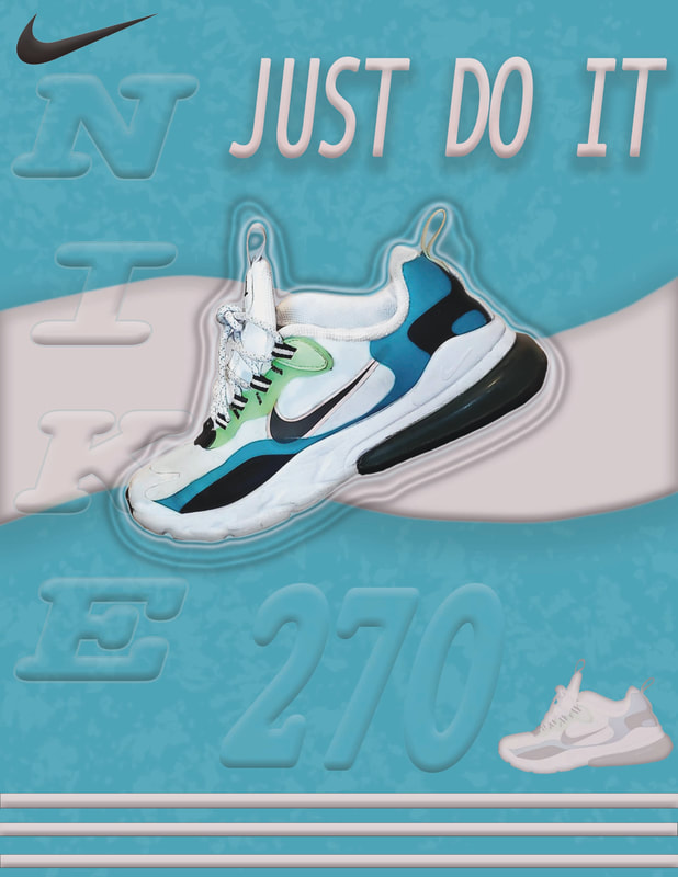
What I was originally planning for my shoe advertisement was more of a retro vibe but I don't think it turned out how I was expecting. Overall I really like it though, with the colour combination and the style. After opening my shoe photo and getting rid of the background by using the lasso tool and masking tool, I dragged the shoe onto the blank page I created. I wanted the shoe to be in the centre of the page so it would get the most attention. I spent a while working on the layer effects to make the shoes more interesting and eventually decided on using the outer glow effect and the drop shadow to create the lines surrounding the shoe. Once I was satisfied with my shoe, I made sure to click the lock icon so I wouldn't accidentally do something to it. By this point I had a shoe and a white background, so what I did was change the background to a similar colour of the blue in the shoe. After that I made a new layer and made a wavy line in the centre of the page. I coloured it in with the pastel pink that's around the Nike symbol on the shoe, and added highlights and shadows with the bevel and emboss tool. Then to add some more detail with the advertisement I used the rectangle tool to make stripes at the bottom of the ad, coloured it in the same shade of pink, and used the same layer effects as I did with the wavy line. As for how I got the small version of the shoe in the bottom right, all I did was duplicate the shoe I already had in the ad, adjust its size, and add in a colour overlay. Now that most of my details were completed, I added my text in, and changed the font, sizing, kerning, and blending mode. Since the ad still looked a bit bland, I made a new layer and used a brush tool to add texture to the blue background. I made sure to put that layer below all my already existing layers so nothing would get covered up. To add the Nike logo onto my ad, I did the same process as what I did in the practice shoe advertisement. Using the same layer effects as the big wavy line, I decided against changing the colour to pink, just because the logo wouldn't have been that noticeable, which isn't good considering I'm advertising Nike shoes. All in all, making this advertisement was really fun and I'm glad I got to learn new skills and get better at photoshop.
Halloween Poster
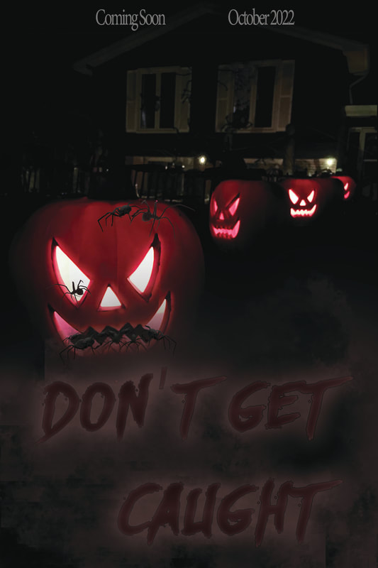
This is my Halloween poster. I was inspired by the fake spiders coming out of the house windows in the background, so I decided to make the movie poster have a spider theme. The first thing I did was create a 12 x 18 poster on photoshop, with 300 pixels. Then after opening my Halloween photo, I adjusted the sizing so it would fit on the page. I thought it would be cool to have spiders coming out of the pumpkins, so I went on Google and copy and pasted spider photos with a transparent background, added some bevel and emboss, drop shadow, and satin effect to the layer. I repeated this multiple times on all the spiders until I felt satisfied with the amount. Then, because I still had space at the bottom on the poster, I created a new layer and used one of the brushes to make a fog effect. I originally wanted to copy and paste a spider web on the bottom instead of adding fog, but all the pictures I found were too blurry or costed money. Anyways, after doing the fog I made another layer, used the text button and wrote down my movie poster title "Don't Get Caught," as in don't get caught in the spiders web. To get the font, I went on Defont, found a text I liked, downloaded it, then installed it onto my photoshop fonts to use. I changed the color to dark burgundy red and added an outer glow and stroke effects. Finally, I added the text on the top of the poster and made it centered.