Lightroom
Lightroom
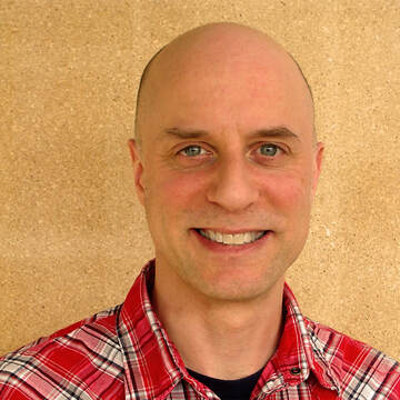
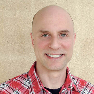
Yellow Man Before and After
|
|
The first thing I did with the yellow man was change the white balance. I did this by clicking on the dropper and selecting a middle gray color. Then I upped the exposer a smidge and lowered the contrast just so the man's wrinkles are less clear to see. I also made the whites and blacks higher, turned down the clarity, and turned down the saturation to make his rosacea less noticeable. Using the radial tool, I made the man's teeth brighter, got rid of some of his wrinkles and fine lines, brightened up his eyes a bit, and also made the white part of his eyes whiter.
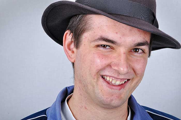
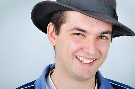
Cowboy Man Before and After
|
|
The first thing I did to the cowboy man was fix the white balance. Then I turned up the exposer a little bit to make the photo brighter, and moved the shadows tool bar lower. Since his skin is pretty uneven, I turned down the texture and clarity to give him a smoother complexion. The, using the radial tool I whitened his teeth, got rid of the red spots on his neck and face, made the wrinkles less prominent, and darkened his hair.
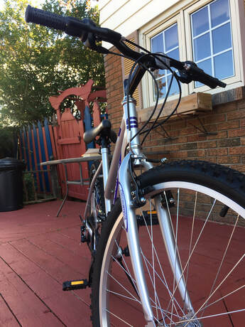
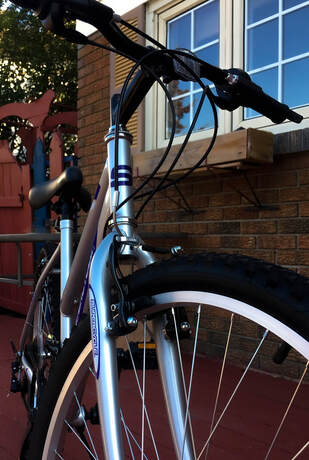
Bike Angles
Before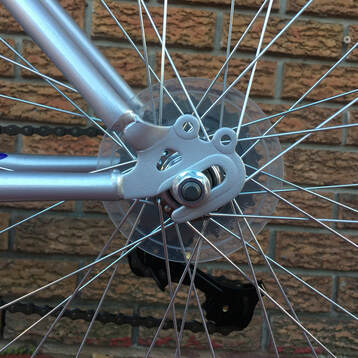
|
After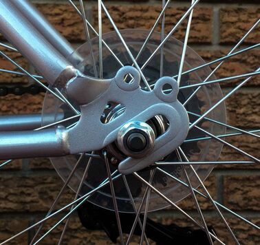
|
I chose this photo because I liked its radial balance. After I cropped and changed the white balance, I decided to make the bike lines more visible and contrast against the back ground. To do this, I lowered the exposer a little, and turned down the texture so the brick wall wouldn't stand out as much. Then I lowered the blacks, and turned up the highlights, whites, and contrast which helped the bike stand out more. On the original photo, there was a yellow stain on the bike. I got rid of this by using the marquee tool.
|
|
This photo was taken at an interesting angle, which is why I picked it. I used the dropper tool to find the white balance, and then cropped it so the bike was closer and the bike wheel was covering a third of the image. I wanted my bike to look metallic and shiny, so I turned down the exposer, increased the contrast, and moved the blacks slider to the left.
Patterns
Before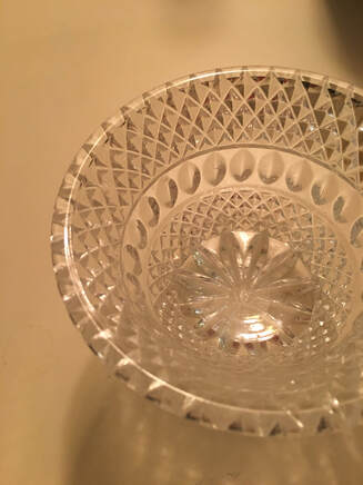
|
After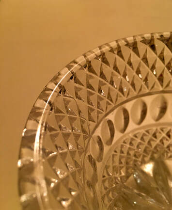
|
I chose this photo for my pattern assignment because I really liked the intricate patterns on the cup. I thought it looked unique, and very detailed. The first thing I did was crop the image. I couldn't find any medium grey in the photo so I ended up not fixing the white balance. I turned down the blacks, which boosted the contrast and structure in the cup patterns and made the photo have more of a golden color. I liked the golden color because it reminded me of royalty.
Before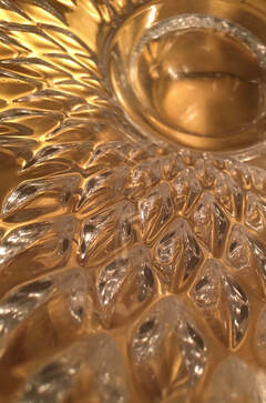
|
After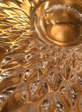
|
This picture shows the patterns in a bowl I found in my basement. I chose it because I was inspired by the previous picture I took of the cup, and wanted both photos to have a royal theme. After I cropped the photo, I increased the highlights so the light reflecting the bowl would be brighter. I moved the shadows slider to the left as well, and the increased the texture and clarity, which made the photo look sharper and more defined.
Giving Thanks
Before
|
After
|
This is a photo of when I volunteered to package food to give to families for Thanksgiving. To start off, I changed the white balance to make the photo appear more natural. I cropped the image to keep it center weighted and balanced. Because the photo was taken where the sun was slightly behind us, our faces and bodies were darkened, and the shadows were were too eye catching since it contrasted so greatly to the pavement. I turned down the contrast and increased the shadow slider in order to decrease the difference between the brighter and darker parts of the image.
Before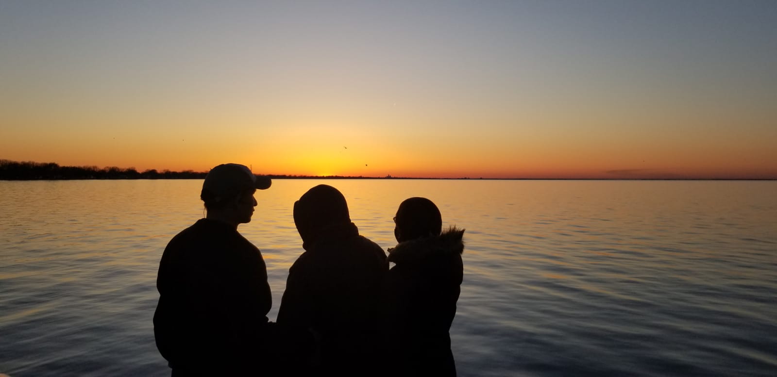
|
After
|
This photo was taken in Belle River. I used the dropper and found a medium gray color in the waves to fix the white balance, and cropped the sides of the photo so the 3 people would be in the centre. To be honest, I didn't really edit it that much because the lighting was already very nice. The only thing I did was turn down the highlights a little to darken the sky and waves. and accentuate the sunset even more.
Autumn
Before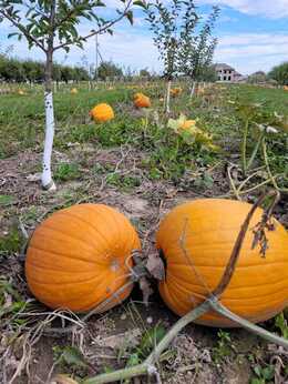
|
After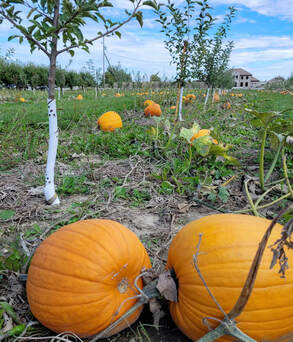
|
I actually took this image at an apple picking farm because I liked how all the pumpkins were in rows. To begin with, I fixed the white balance and cropped the image to make it more bottom weighted, making it so the two pumpkin are the first place you look at. Then I turned the highlights down to bring out the blue color of the sky. I wanted to make the two pumpkins stand out a bit more, so I turned the texture up to show off shape and ridges of the pumpkin rind. Also, since I thought the roots and soil were ugly, I made them less noticeable by turning the clarity down slightly.
Before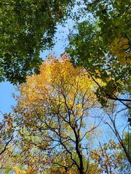
|
After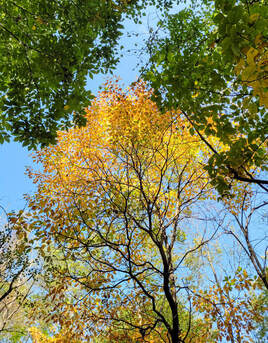
|
This was taken while I was on a walk on Ganatchio trail. After I used the dropper to white balance it, I cropped the photo to cut out some of the green leaves so the yellow-orange tree was closer to the center. Similar to the pumpkin photo I took, I turned down the highlights to make the sky more blue. I also moved the shadow slider to the right, which made the whole picture look more vibrant and added to the autumn theme I was going for. The last thing I did was increase the texture, to add in some detail to the leaves.
Shoe Advertisement
Before
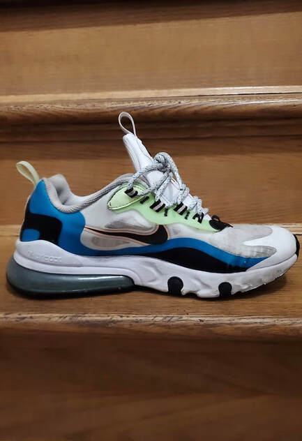
|
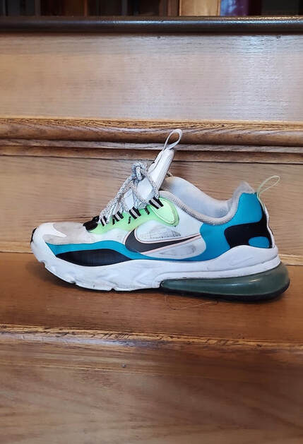
|
After
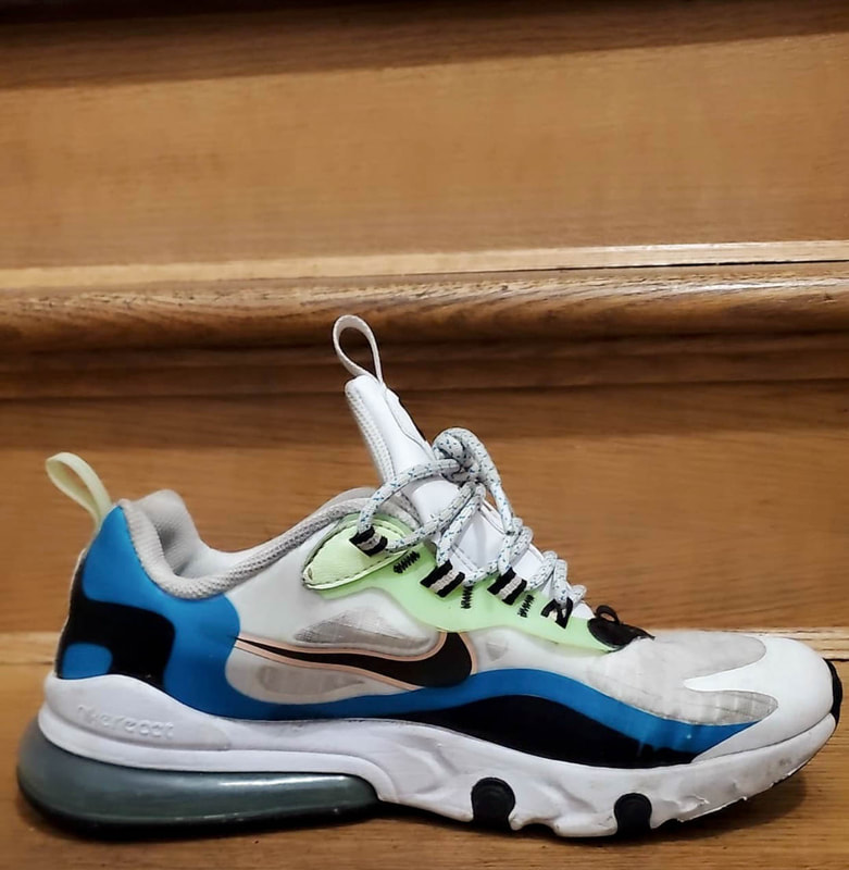
|
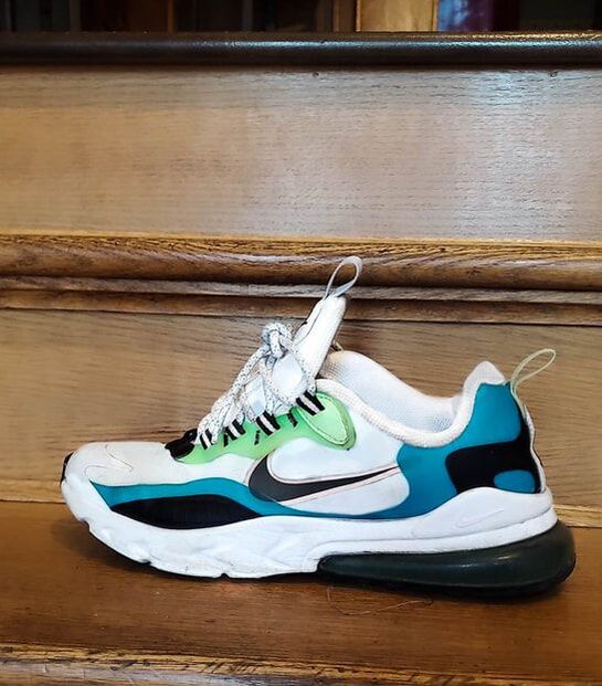
|
I chose these shoe pictures to edit because I knew that I wanted to use these for my shoe print advertisement. After changing the white balance, I cropped both of the photos so it was bottom weighted. Originally, the shoes were pretty dirty but I adjusted the exposure, shadows, whites, and darks to make it whiter and cleaner. As you can see, the shoe on the left isn't as edited as the shoe on the right. This is because I knew for sure that I wanted the shoe on the right to be the main focus, and the other one to be used as a small background image that's just for the extra detail so it didn't really matter if it was a little uglier. Anyways, I used the radial tool to fix up the darker and dirtier parts of the shoe even more, as well as make the blue, green, and light pink colours saturated without changing the entire shoe. One thing I didn't like about the shoe was the tiled texture looked ugly and grey (you can see this on the left shoe). To fix this, I just used the clone tool to remove the tiled areas and replace it with other parts of the shoe.
Halloween
Before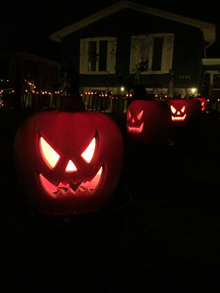
|
After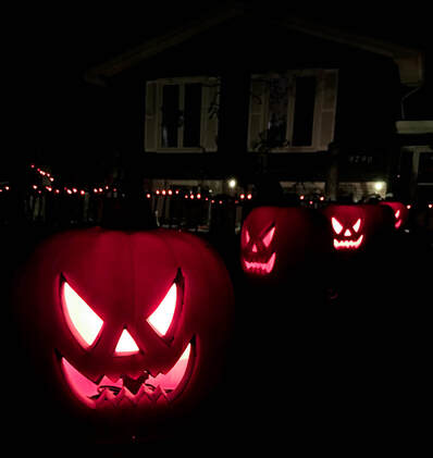
|
I really liked this photo because of how all the pumpkins are in a line. The pink light with the dark background also looks really cool. After fixing the white balance, I cropped the photo to make the pumpkin on the left stand out more. Then I increased the contrast and moved the blacks slider to the left so the house in the back wouldn't be as noticeable, as well as make the photo scarier and more interesting. Since the pumpkins are fake, they originally looked a lot smoother than they do now, so I increased the texture slightly just to make the pumpkins a little more realistic.
Before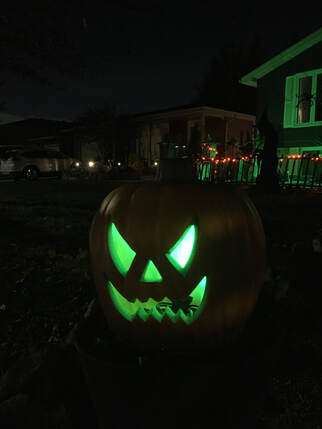
|
After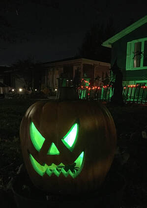
|
Although this photo is a bit more blurry and pixellated, it kind of gives me homemade student film vibes, or something that was taken from a really old film cam. (but in reality it's just my bad phone quality that makes the picture look like this). After fixing the white balance I cropped it to make the photo bottom weighted. Then I turned the contrast down a little bit and increased the shadows slightly. he last thing I did turn up the Dehaze tool in order to bring out some of the details in the picture.